Bilibili
Bilibili Data Project II: Data Analysis
Introduction
The data acquisition methods are explained in the post Bilibili Data Project I: Data Acquisition.
In this post, I will explain the data analysis process of this project.
Summary
The total video-id range is [1,23323833] by the time 2018-05-11 23:06:34.597336. I extracted 15920858 total entries from the website.
As I walk through the data, I found no obvious evidence for data fraud. In this section, I will demonstrate several interesting statistics about these video.
Video ID Filling Rate
I calculated the filling rate of video ids, i.e., the percentage of video ids that are actually associated with videos,
\[\begin{equation} F = \frac{\text{Number of video IDs associated with videos} }{ \text{ Video ID range} }. \end{equation}\]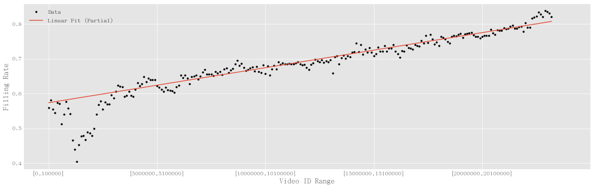
Filling rate of video IDs. The black dots are the data. The red line is a linear fit for the video IDs range starting from [3000000,3100000].
I observed that the filling rate of video IDs are filled more, as the linear fit for the linear part of data shows. I could think of three reasons.
- Videos are removed less than before because of qualities, change of policies, or lack of moderators.
- Videos are removed through a long term of observations by the website. Older videos had long time to be exposed for deletions.
- Some change in the website’s concentrations of video types. For example, they might bave a lot of pirated videos in the begining and deleted them due to copyright requests. The pit which happend between 2015-10-03 and 2014-03-08 is possibly related to this.
The fact that the filling rate is linear is kind of suprising.
Views of Videos
I extracted the total views averaged over 10 days for different video submission dates. I see the grow of views. The website has obtained more users as I read from the news. It’s not surporising that the total number of views has grow to a large number, which is more than 1 billion. I do not find sudden changes of views. If any fraud data is present, abrupt changes in the pattern should be observed unless the fraud is done gradually.
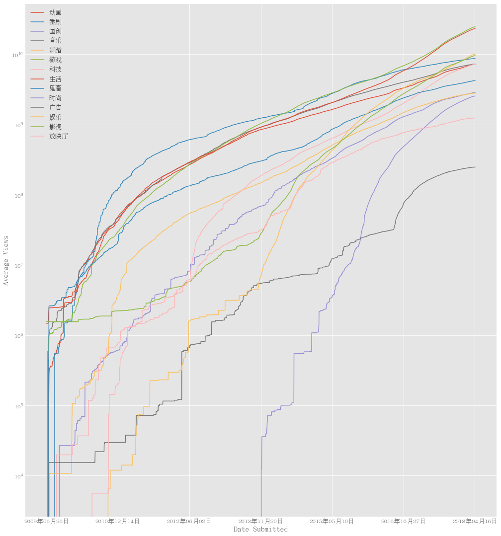
Average views of videos as a function of date submitted for each categories. The number of views for videos is increasing fast as the publication dates becomes more recent. The views are averaged over 10 days.
On the other hand, I can calculate the histogram of views. I would expect that most videos do not have a lot of views.
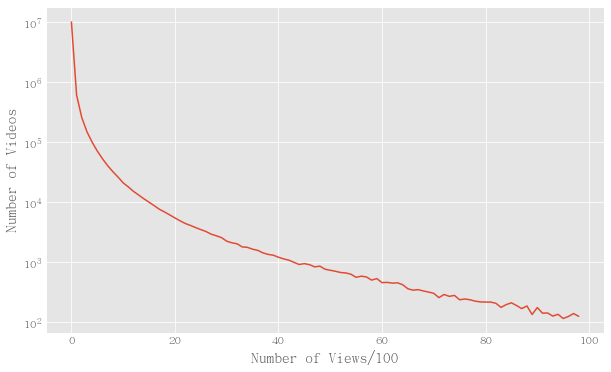
Histogram for views. It has a long tail.
The behavior for number of likes and coins since they are related to each other so closely, which I will show later. It’s kind of trivial.
Duration of Videos
There are many descriptive tasks for this dataset. I would like to show one more interesting behavior. The duration of videos are not some trivial guessing. I would say video duration doesn’t become too long. Meanwhile, the video duration doesn’t become too short such as 0 second. So there must be a peak.
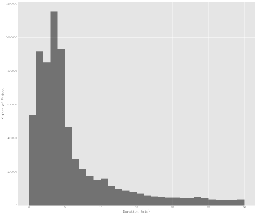
Histogram for duration. As the qualitative analysis argument shows, a peak is prove to be exist at 4 min.
Correlations between Views of Videos and Fans of Creators
This is a natural guess. Here I provide proof. In the previous post, I have showed a demo of the dashboard that I created for continuous tracking of users and their videos. We clearly observe a correlation between the curves of views and number of fans.
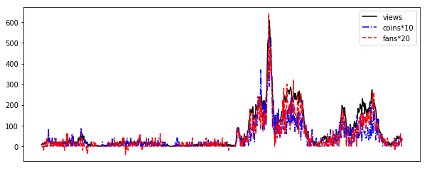
Correlation between views and fans. The plot shows the increments of views of all videos created by the user uupers and the fans of this account.
I have the passive and active interpretation of this plot. I would go with the active view. The views are converted to fans and coins. Hereby I conclude that the conversion from views to fans is about 1/20, and the conversion from views to coins is about 1/10.
Tech Stack
- Python
- Pandas
Methods
Since I have chosen to use pandas, I created pandas data frames from the csv data files.
As for a first step, I would like to make a scatter matrix for all the data.
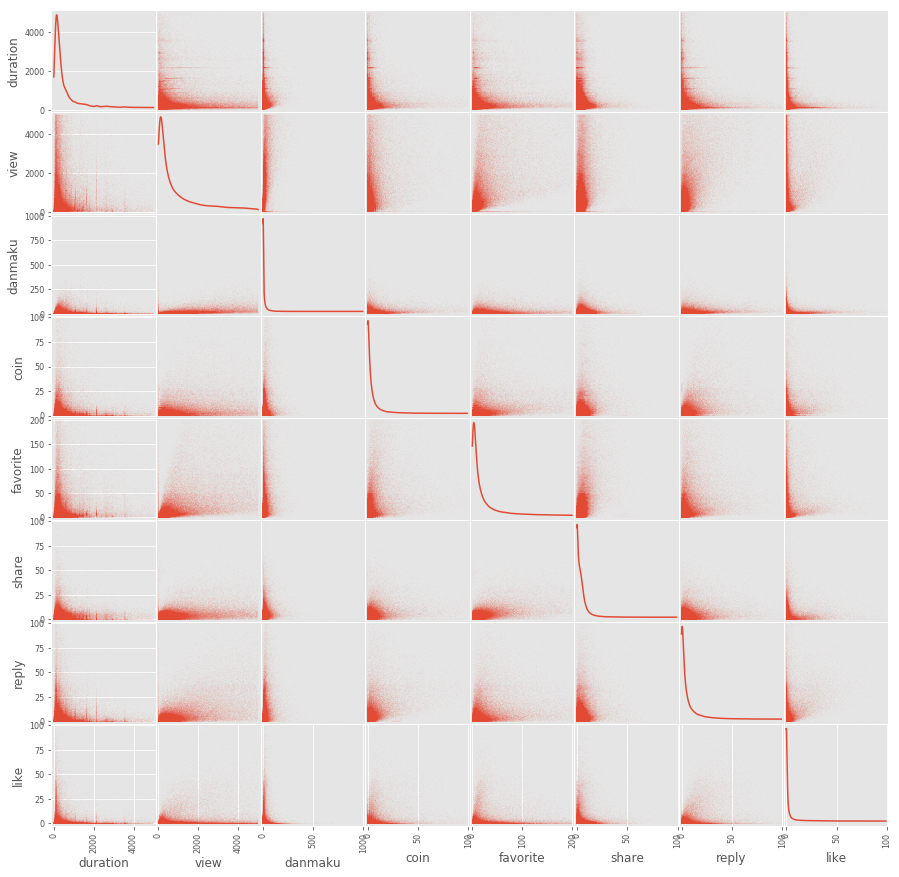
Scatter matrix for all the dimension of data. We do find of nice correlations between quantities. However, they are utterly trivial.
Unsupervised Learning?
I would like to see if the data points cluster into patches. So I performed Principle Component Analysis on the video meta data.
I use scikit-learn for the PCA. After standardize the data, I could perform the analysis and plot the results.
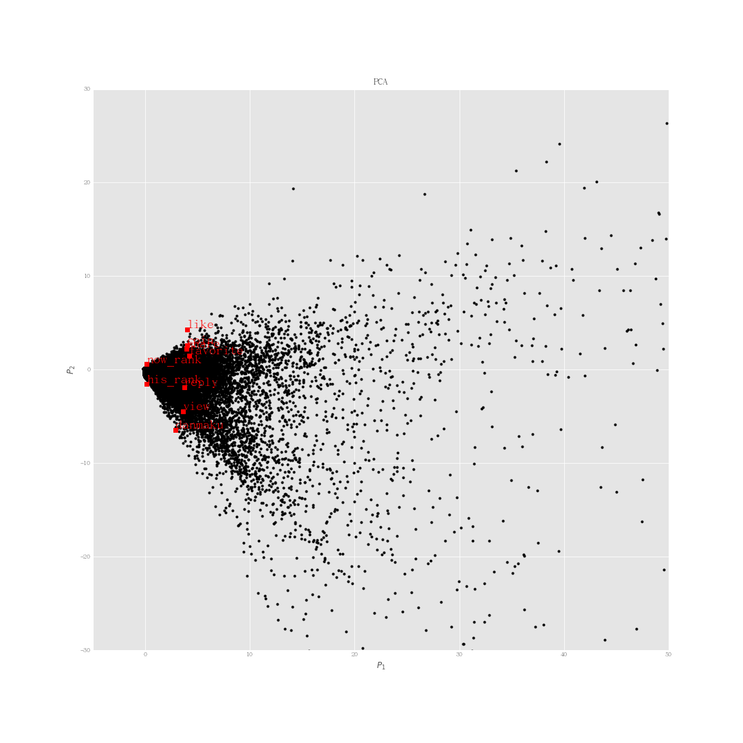
PCA of video data. I find only one cluster.
The explained variace of the two principle components are $0.479$ and $0.126$. Those two principle components only take accounts of $60.5%$ of the information. This amount of information doesn’t seem to be good enough to represent the data set. On the other hand, the third principle component only takes in $11.1%$ of the total information, which is still not good.
K-means clustering will cluster our videos into the number clusters I want but I do not expect to get anything useful from it. Before I work out the clustering, I would surely guess one of the cluster has a centroid around zero. The analysis confirms it. The first centroid is at
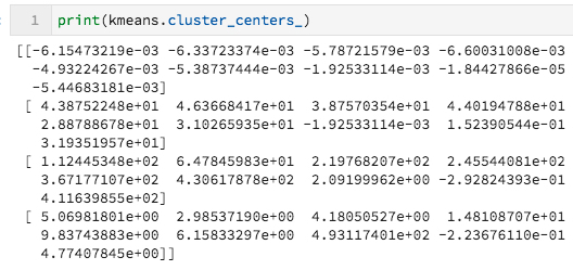
K-means clustering
Future Work
I have done some more predictive work using bubble chart to show the possible correlations between 3 dimensional data.
Notes
- The coin is the virtual currency of the website. Coins are gifted to creators of videos by the viewers.